Godot Tutorial: Scalable UI for different screen sizes
Introduction
When creating a mobile game, designing a user interface that is optimized for the device’s screen size is a critical task. Players may struggle to read text or view graphics that are too small on their 6-inch phone screens, especially if the game was originally developed for desktop platforms. This is also true for portable consoles such as the Nintendo Switch, which require careful consideration of screen size and density.
In this blog post, we will explore how to keep user interfaces legible on a variety of devices, regardless of their screen size and density, using Godot Engine. While some developers might opt to create different UI designs for different screen sizes and densities, we won’t be discussing that approach. Additionally, we won’t cover the “Allow hidpi” options since these are not available on mobile devices.
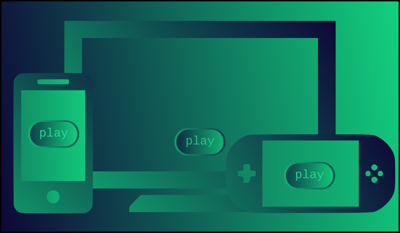
Before we dive in, you can access a template project with a pre-designed UI to test the concepts we’ll be discussing below. You can find the project here.
General Concepts
Let’s first clarify some basic concepts related to device screens:
- Resolution: The number of pixels on a screen. For example, a Full HD PC monitor has a resolution of 1920 pixels in width and 1080 pixels in height, regardless of screen size. Two monitors with different physical sizes (e.g., 24 inches vs. 19 inches) can have the same resolution of 1920×1080 pixels.
- Screen density: This value specifies the number of pixels that can fit within a physical length unit of the screen, typically expressed as “dots per inch” (DPI). For example, a monitor with a density of 141 DPI can fit 141 pixels within a one-inch length.
- Screen size: The physical size of the screen, typically expressed in inches from the top-left corner to the bottom-right corner. For example, a laptop screen may be 15 inches in size (measured only for the display area).
Now, let’s do some math with this information. Suppose we have a Full HD screen with a density of 141 DPI. Since the screen can fit 141 pixels within a one-inch length, and the screen has a width of 1920 pixels, we can calculate that the screen has a width of 13.6 inches (34.6 cm). With the same logic, we can calculate that the screen has a height of 7.7 inches (19.5 cm).
For the remainder of this post, we assume that you have a mobile device with higher DPI than your desktop PC. Additionally, make sure you can run Godot projects on your device. Check the official documentation pages for Android and iOS if you need help with this.
How dpi affects UI
When creating a mobile game, it’s crucial to consider the screen’s dpi, as it can significantly impact the size and legibility of UI elements. For instance, if you design a button that measures around 150×50 pixels on a screen with a dpi of 141, it would have an actual size of 1.06 x 0.35 inches (2.7 x 0.9 cm), which is likely easy to read. However, if the same button is displayed on another screen with a dpi of 320 (known as xhdpi), its size would shrink down to 0.47 x 0.16 inches (1.2 x 0.4 cm), making it challenging to read.
Using the stretch shrink setting to scale the UI
Run the template project on both your desktop PC and mobile device to see how the UI appears differently due to the difference in pixel densities. Let’s see how we can fix it.
In the project settings, navigate to Window category and look for Stretch.
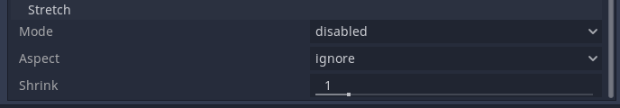
Within Stretch you will find the Shrink parameter. This setting allows you to define a scale for all CanvasItem elements in the game, including every 2D and Control nodes.
If you’re developing a 3D game that should work on both desktop and mobile, it’s likely that you’ll want to keep the Stretch Mode as “Ignore”.
To make the UI more readable on small, high-density screens, one option is to set the Shrink parameter to a higher value, such as 2, which will make every 2D and Control node appear twice as big.
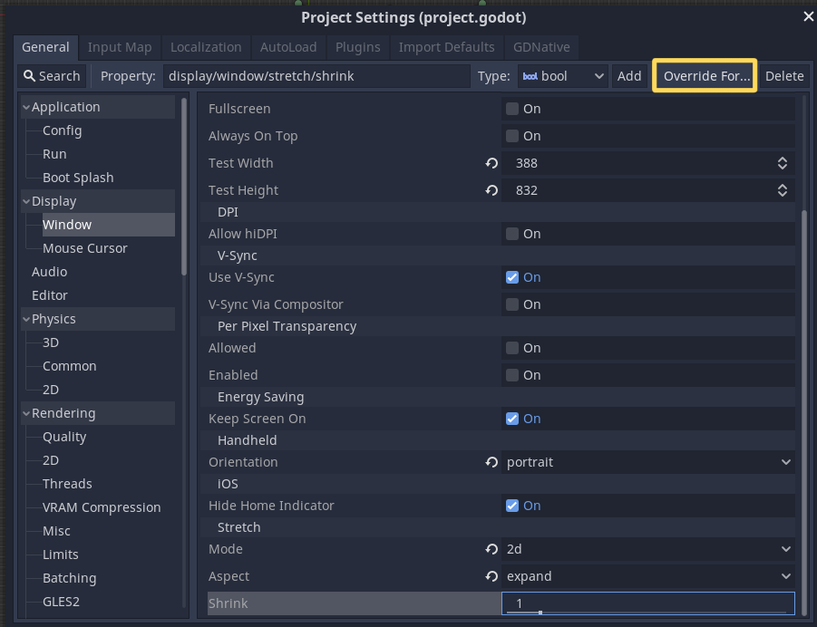
You can then run the template project on your mobile device with these settings, and everything should appear more readable. However, if you run the same project on your desktop PC, everything will be too big. Fortunately, Godot provides a way to override a parameter of the configuration given some flags. To do so, navigate to Window -> Stretch -> Shrink, select the Shirnk setting and press on the “Override for” menu button at the top of the dialog. Select “mobile” in the drop down menu, and a new setting will appear at the bottom, called Shrink.mobile. Set it to 2 and restore the original Shrink setting to 1.
With this procedure, the UI and 2D elements of your game will only be scaled up in mobile devices. However, this solution is not perfect since mobile devices come in a wide range of DPIs. As a result, this approach can make the UI look too large on some devices and too small on others. To address this issue, we need a more sophisticated solution that can adapt to different screen sizes and resolutions.
Making the Control nodes size dpi independent
To ensure your UI remains readable on high-dpi devices, you may want to maintain the physical size of your controls in inches (or cm), regardless of the device’s dpi. For example, a button with 150px width will have a physical width of 1.06″ on a 141 dpi screen, but only 0.34″ on a 440 dpi screen. To maintain the intended physical size, we need to scale the button on the 440 dpi device by a factor of 440/141=3.12.
Godot provides some useful methods to get screen information, such as OS.get_screen_dpi(). We can use this method to get the dpi of the device where the game is running, and then set the Shrink value dynamically to maintain physical size in inches (or cm) of the controls the same across different devices.
So we can add the following code to set the game set the Shrink following that logic:
var host_device_dpi := 141.0
var stretch_mode := SceneTree.STRETCH_MODE_DISABLED
var stretch_aspect := SceneTree.STRETCH_ASPECT_IGNORE
onready var target_device_dpi := OS.get_screen_dpi()

func _ready():
	var shrink = target_device_dpi / host_device_dpi
	get_tree().set_screen_stretch(stretch_mode, stretch_aspect, Vector2.ZERO, shrink)
Note that host_device_dpi was set to the value of my screen dpi. The variables stretch_mode and stretch_aspect were set considering a 3D game is being developed.
This script offers a simple solution to ensure that your 2D elements maintain the same physical size across devices, regardless of their dpi. This means that if your UI was readable on your desktop PC, it will also be readable on any device. You can use it in your main game scene, or just in an autoload, so it gets executed right away when the game launches.
Priorizing text over style
Scaling everything to keep the original physical size may be not ideal in all cases, For instance, a 1″ button may be too big for a device with a 2.5″ width. As text is often the biggest issue when porting a game to mobile, prioritizing it when scaling can be beneficial.
To do this, first determine the smallest readable font size on your development PC. For example, a font size of 12px is comfortable to read on a screen with 141 dpi, equivalent to a height of 0.085″. However, in the game, a font size of 16px is used as the smallest, which gives a height of 0.113″.
On a phone with 440 dpi, the same font size of 16px is only 0.036″ tall, so it needs to be scaled up by a factor of 2.46 (0.085/0.036) to be the minimum comfortable size to read.
This calculation can be sumarized as:
var shrink = minimum_used_font / minimum_readable_font * target_device_dpi / host_device_dpi
Note that if you already use the minimum readable font size while designing, this won’t have any effect and the result will be the same than in the previous section.
The problem we have now, is that this will scale to the minimum readable size on any device, without caring about the space we had in the design. Having in mind that the purpose of this was to not scale up more than needed, we can apply this formula only if we need to scale up, but leave the shrink unchanged (i.e. with a value of 1) otherwise.
With those changes, the script now looks like this:
var host_device_dpi := 141.0
var stretch_mode := SceneTree.STRETCH_MODE_DISABLED
var stretch_aspect := SceneTree.STRETCH_ASPECT_IGNORE

var smallest_readable_font := 12.0
var smallest_used_font := 16.0

onready var target_device_dpi := OS.get_screen_dpi()

func _ready():
	var shrink = max(1, smallest_readable_font / smallest_used_font * target_device_dpi / host_device_dpi)
	get_tree().set_screen_stretch(stretch_mode, stretch_aspect, Vector2(640,480), shrink)
The problem for 2D games
The previous approaches are suitable when your game is in 3D, as the stretch shrink parameter only scales UI and 2D nodes.
But if you are developing a 2D game, it will also scale your game and you will end up seeing much less content in a mobile phone than in your desktop pc.
An easy trick we may use in these cases is to design all your UI as a child of a single Control node, just like in the template project. The layout of that control node needs to be set at “Full Rect”, or alternatively, set the left, top, right, and bottom anchors to 0, 0, 1, and 1 respectively.
If you scale up that control by the desired amount, all your UI that was created as a child of it will also scale, but it will expand outside the screen if you scaled up, or not cover the whole screen if you scaled down. To fix this, you can divide the anchor values by the scale ammount:
By doing a small modification to the script of the previous section, and attaching it to the root Control node of the UI, you can perform this scaling:
extends Control

var host_device_dpi := 141.0
var stretch_mode := SceneTree.STRETCH_MODE_DISABLED
var stretch_aspect := SceneTree.STRETCH_ASPECT_IGNORE

var smallest_readable_font := 12.0
var smallest_used_font := 16.0

onready var target_device_dpi := OS.get_screen_dpi()

func _ready():
	var scale = max(1, smallest_readable_font / smallest_used_font * target_device_dpi / host_device_dpi)
	rect_scale = Vector2(scale, scale)
	anchor_bottom /= scale
	anchor_top /= scale
	anchor_right /= scale
	anchor_left /= scale
Note that these techniques don’t work for purist pixel-art games, as scaling up the UI is a no-go, because it would make the game loose pixel size consistency. In this case, you don’t have any other choice but designing a specific UI and theme for smaller screens.
Last thoughts
I believe a viable solution to ensure a UI that is easily readable on a variety of devices would be to implement a setting that exclusively scales Control nodes. Given that UI elements all inherit from the Control class, this approach would be applicable to both 2D and 3D games. It would be ideal to have an independent setting that modifies the scale of solely these nodes, without relying on the rect_scale parameter, which may interfere with the developer’s design.
Alternatively, it would also be useful to have something similar to the Stretch settings, but per CanvasLayer node, as we may also want to scale up TouchScreenButton nodes, that don’t inherit from Control nodes.